Visual Identity Development
Case Study
-
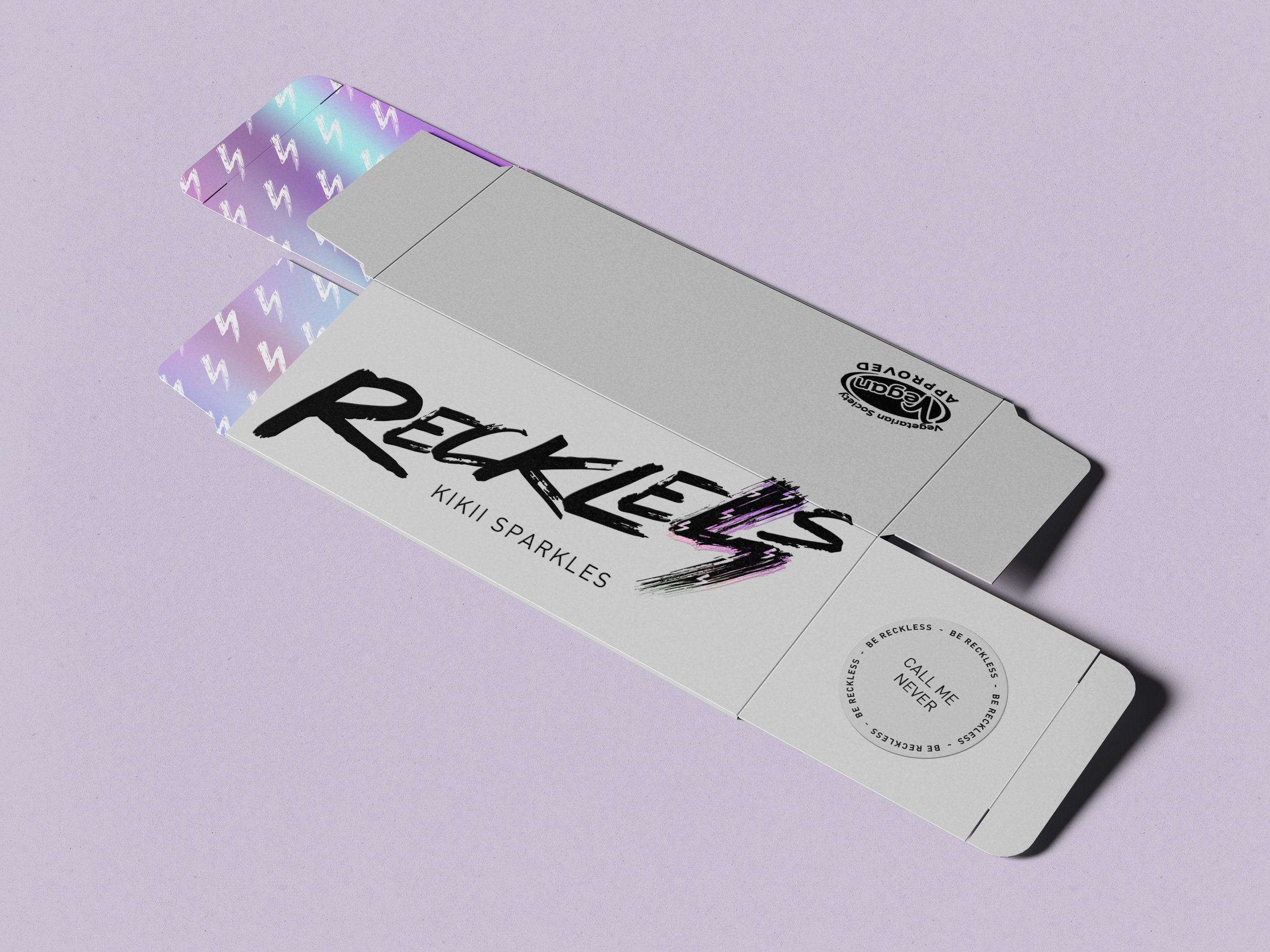
Reckless is a daring cosmetics brand catering to individuals who embrace their boldness and unapologetic spirit. The founder envisioned a visual identity that embodies bravery, aligning with the brand's name and ethos.
-
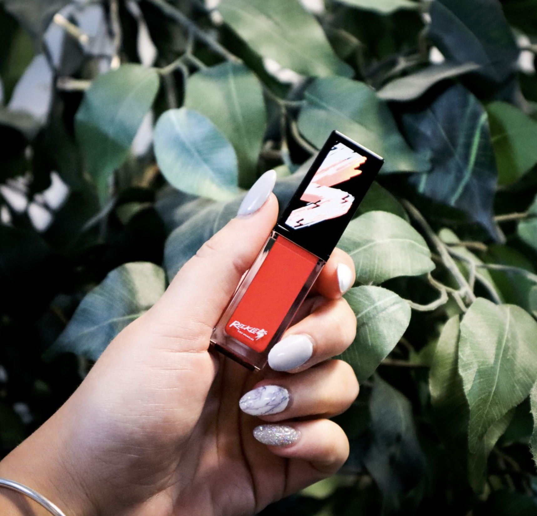
Inspiration for Reckless’ identity came from one of the most fearless icons in pop culture: David Bowie’s lightning-bolt-slashed visage. The lightning bolt became a key symbol for the brand’s energy, confidence, and pride.
To build a narrative around this, we conceptualized:
Lightning as a Metaphor: Electric and striking, it represents individuality and boldness.
Artistic Strokes: A nod to the artistry and craftsmanship involved in self-expression, reinforcing the idea that everyone is their own masterpiece.
Timeless Boldness: Balancing edgy creativity with a polished aesthetic to resonate with the modern, sophisticated beauty consumer.
-
The identity system we developed encapsulates everything Reckless stands for: bravery, artistry, and individuality. The lightning bolt became the cornerstone of the brand, symbolizing the electric energy and pride in being unapologetically yourself.
Our work ensures Reckless doesn’t just compete in the cosmetics industry—it commands attention.
The Inspiration
The RECKLESS icon is inspired by David Bowie’s iconic lightning-bolt-slashed visage. Lightning is electric; it’s a giant spark that exudes confidence and echoes with pride. The paint-like stroke symbolizes the artistry involved in creating one’s identity—a reminder that you are your own masterpiece.


